2021: Graphic & Communication Design BA Hons
Showcase
Statement
Hi, I am Tom! I specialise in brand identity, design in sport and can do a bit of photography on the side! If that sounds like something that interests you, feel free to scroll through my work.
VISITFARNHAM
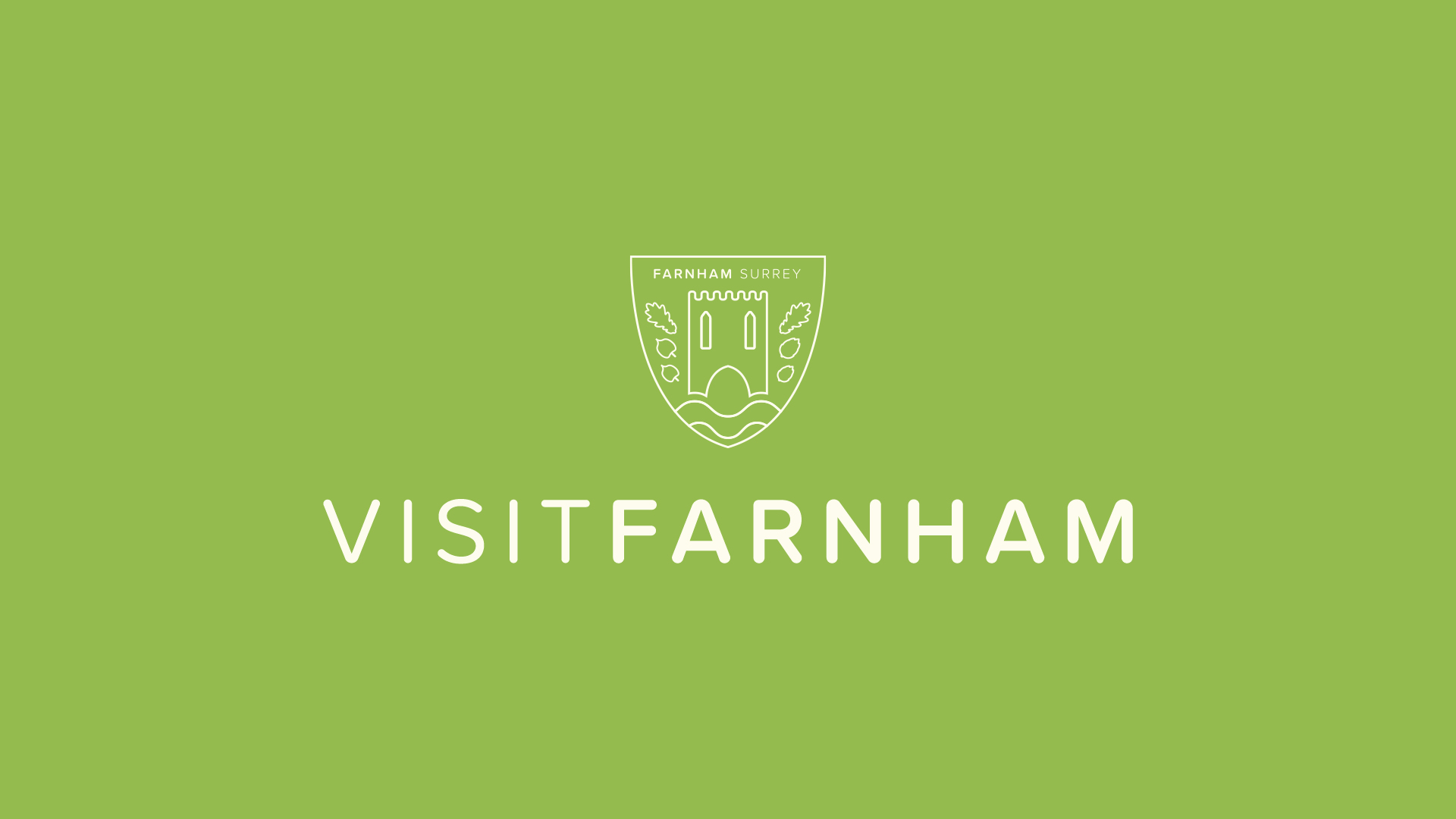
VISITFARNHAM Logo
During the first lockdown, I undertook a self initiated project to brand a tourism department for my hometown, Farnham. Only an hour on the train from London, I have always felt that the town doesn’t do enough to attract day-trippers, so I thought I’d put right to that. The logo’s shape is inspired by the entrance of a local cave, which is centre of many local folklores. This provides a clean shape for the rest of the elements to sit inside. The castle is the key centre-piece as this is arguably the town’s most famous attraction, whilst the windows are shaped the same as those found in Waverley Abbey, England’s first cistern abbey. The two larger leaves are oak leaves, whilst the leaves on the left are lime leaves, with both trees found throughout Farnham Park – a park that has seen the likes of King Henry VIII visit and hunt deer in its grounds. The smaller leaves on the right are in fact hops, which symbolise the towns relationship with beer and breweries. The river shape at the bottom of the logo pays homage to the River Wey which flows through the town, but simultaneously represents the many paths in the town, park and surrounding countryside that can be explored. The logo is designed using lines. This is inspired by current design trends, showing the town is current and trendy; important for attracting visitors. It also represents the town’s status as a Craft Town, with the animation of the logo being similar to that if it was being drawn with a pen.
Poster Montage
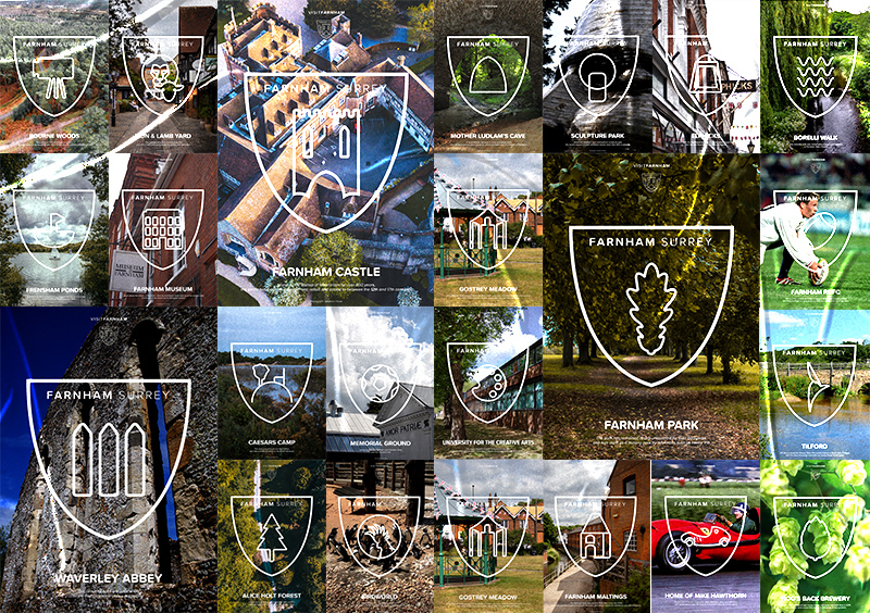
Alongside the overall logo, a set of sub-logos were designed for each individual attraction in the town. This allowed for each place to be recognised individually, and the viewer can gain an understanding of what the attraction is quickly. To ensure brand continuity, the icons were designed at the same weight as the original logo, and placed in the same shield. There are many uses for these icons, such as on posters and banners which would be seen in the town, at the location of the attraction and in surrounding areas to promote them. Each poster has a photography base, inspired by the creative nature of the town, alongside a small description of each attraction so that if the viewer is interested, then they can get a summary quickly.
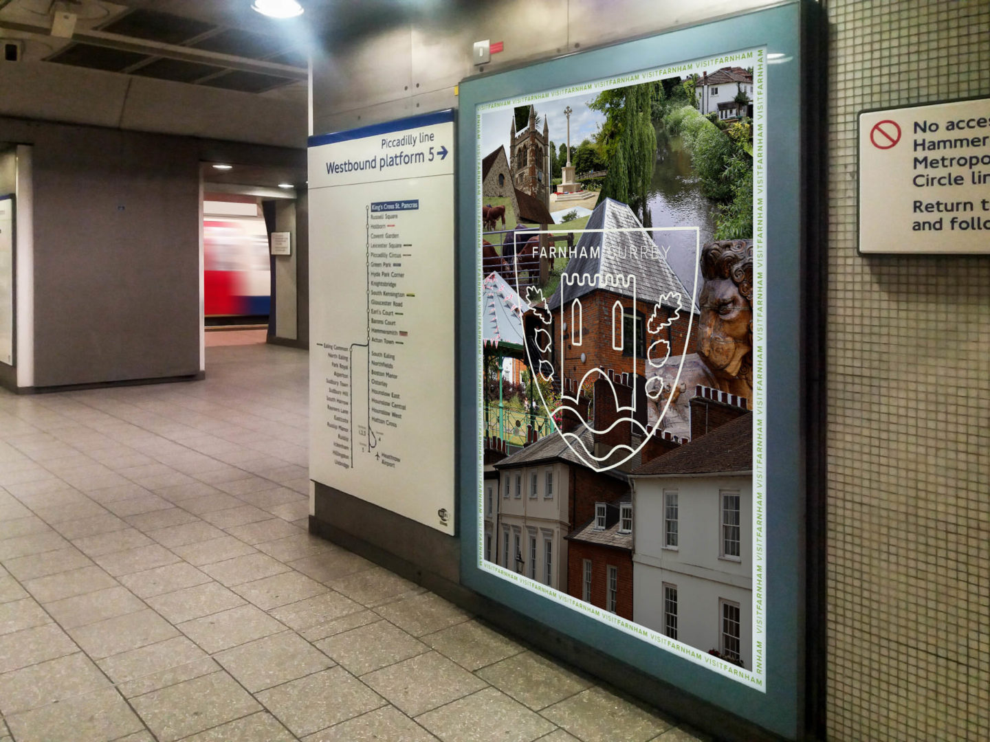
Poster on the London Underground
Farnham is an hour, direct, on the train from London Waterloo. As one of the capital’s major stations, a vast amount of tourists, and locals pass through it daily. A series of print and digital posters have been designed to feature on the Underground and throughout Waterloo station. Designed as a collage – again paying homage to the craft town status and the University of the Creative Arts campus in the town, it provides a quick and visually interesting way to document what the town has to offer. The array of colours and different photographs also attract the viewer’s attention quickly, which is important in such a fast paced environment – they can then choose whether they want to stop and work out the individual elements. The type of person who would visit the town would most likely be interested in history and nature, and therefore take in their surroundings and understand visual challenges, making this an appropriate method to advertise the destination.
JadraExplore
The premise for this project is the world is becoming increasingly divided. Think Brexit, Catalonia, Scotland, and even the Israeli-Palestine conflict that has resurfaced with a vengeance over the last few weeks. I wanted to develop a project that would help bring people together and increase peace and tolerance between different groups. This led me to look at geopolitics and the Balkan region, an area that was once a single country but is now fragmented into many different sovereign states – this proved to be the inspiration for my project. After the separatist movements that have sprung in the Balkans since the fall of Yugoslavia have not delivered the economic and quality of life boost that they promised, the states of Bosnia and Herzegovina, Croatia, Kosovo, Montenegro, North Macedonia, Serbia, and Slovenia, alongside the Italian city of Trieste (Yugoslav territory and a Free State during WWII), held referendums about reunification in an effort to return to the prosperity during the Yugoslav years. Their populations were asked “Would reunification benefit the territories of Bosnia/Croatia/Kosovo/Montenegro/NorthMacedonia/Serbia/Slovenia/Trieste?”. Overall, the response was positive (52%) [this figure is based on a poll conducted by Gallup, 2016], and reunification took place. However, to dispel links with the previous socialist Yugoslav regime and signal the start of a new period of prosperity, the country elected a new name: Jadra. In Serbian, Croatian, and Slovenian the Adriatic Sea, which borders some of the Balkan countries, is better known as the Jadran, which is what inspired the new name of the country because the sea has always provided happiness and work for the people of the region. Then came the thought of how to manifest this in a graphic design project. I thought, what is the best way to bring people together? and settled on the idea that experiencing different cultures for yourself is the best way to achieve education, understanding, and tolerance. Therefore, I settled on the concept of branding a national train network organisation, think National Rail, for my project. *Please note that this project does not reflect my political views on Yugoslavia and reunification*
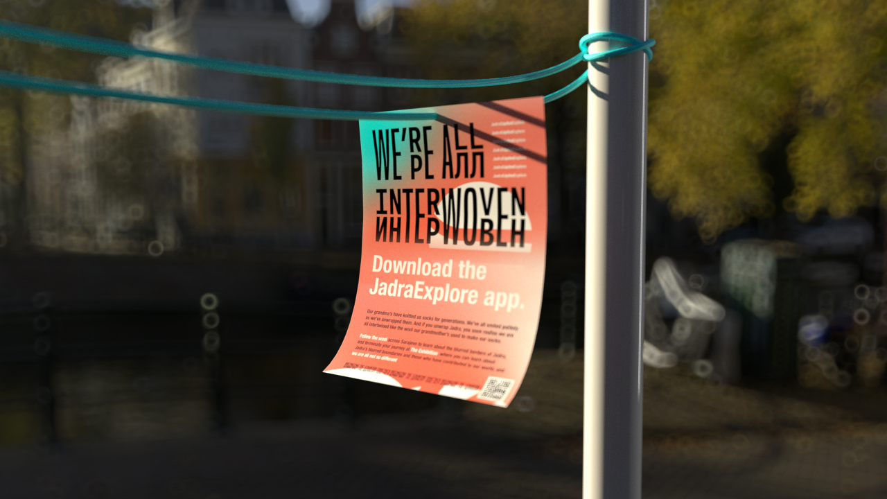
Poster on the outskirts of Belgrade, Serbian Province
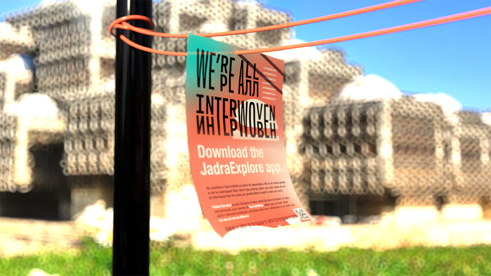
Poster outside the National Library in Pristina, Kosovan Province (an exhibition location)
To promote both JadraExplore’s train services and education and tolerance attitudes, exhibitions in Trieste, Zagreb, Novi Sad, Belgrade, Sarajevo, Banja Luka, Skopje and Pristina were held. These exhibitions promoted the work of people who have made a great contribution to society, but come from mixed backgrounds, helping illustrate that the population is all the same and the borders in the area have always been blurred. Posters were hung around the cities as a way finding technique, with the closer to the exhibition the poster is hung, the more orange the rope that the poster is hung on gets – with the posters that are further away being JadraExplore’s secondary brand colour of turquoise.
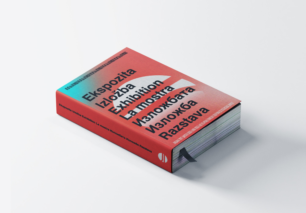
JadraExplore Book
Alongside the exhibition, a book was designed that profiles some of the most famous people in the exhibition. This was printed, in the same edition, in all 8 major languages spoken in Jadra to ensure there was no suppression of languages or cultures.
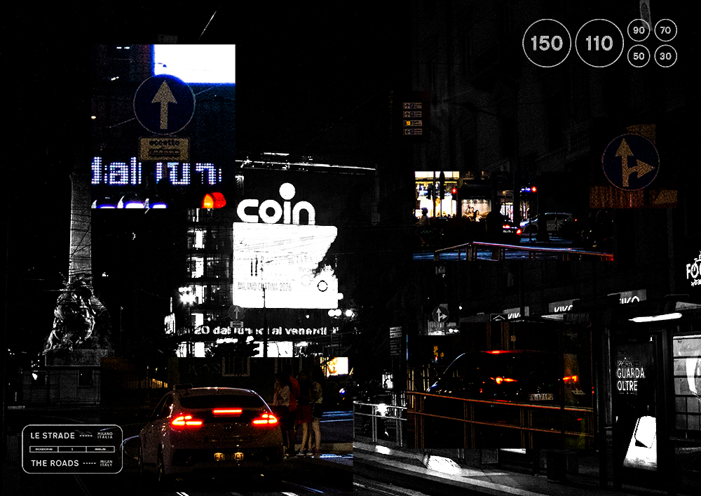
Roads
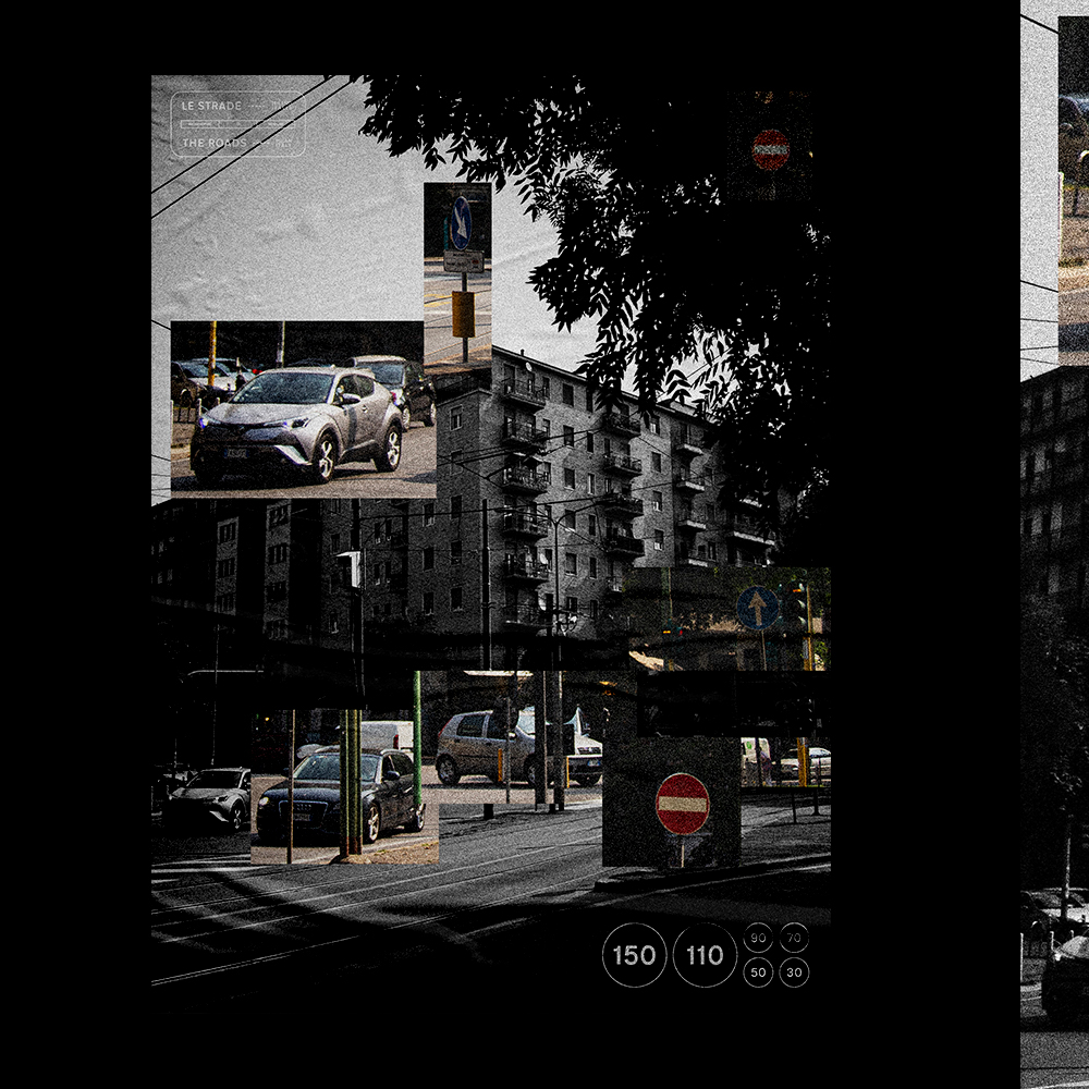
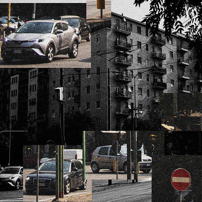
As an avid traveller and photographer, I always take my camera everywhere I go. I often turn my photos into abstract projects, such as this one, titled Roads. The criteria is that the images are in black and white except for the items that have something to do with roads, such as signs, cars or arrows. These are highlighted by being blown out of proportion and added to weird and whacky places across the poster.