Cara Egan
-
ll17c2e@leeds.ac.uk
-
07908194769
2021: Graphic & Communication Design BA Hons
Showcase
Statement
My work looks at using illustration to create brand a brand identity as well as finding ways to use illustration to communicate a mood and tone through imagery.
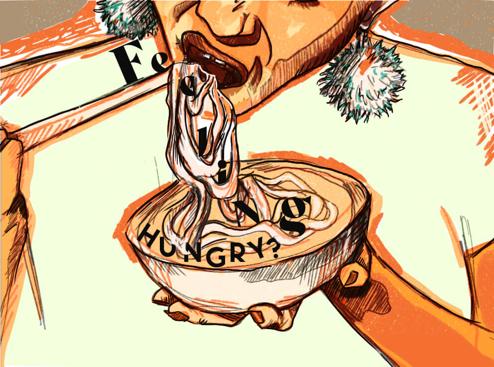
The Kind Cook
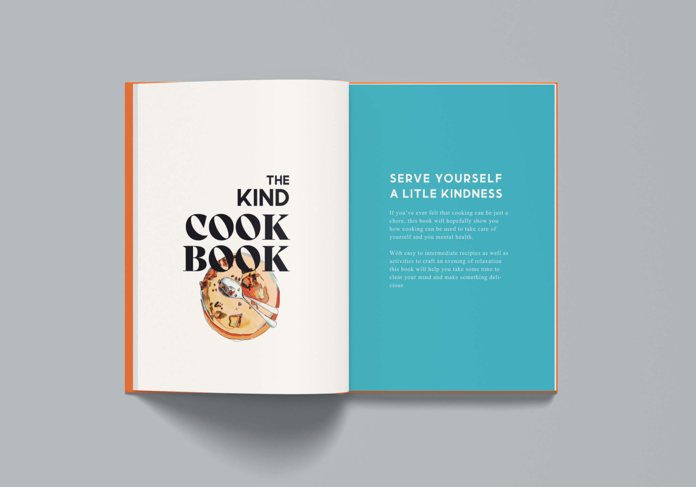
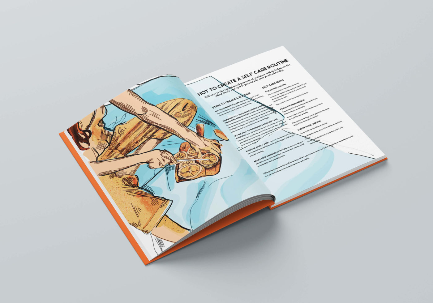
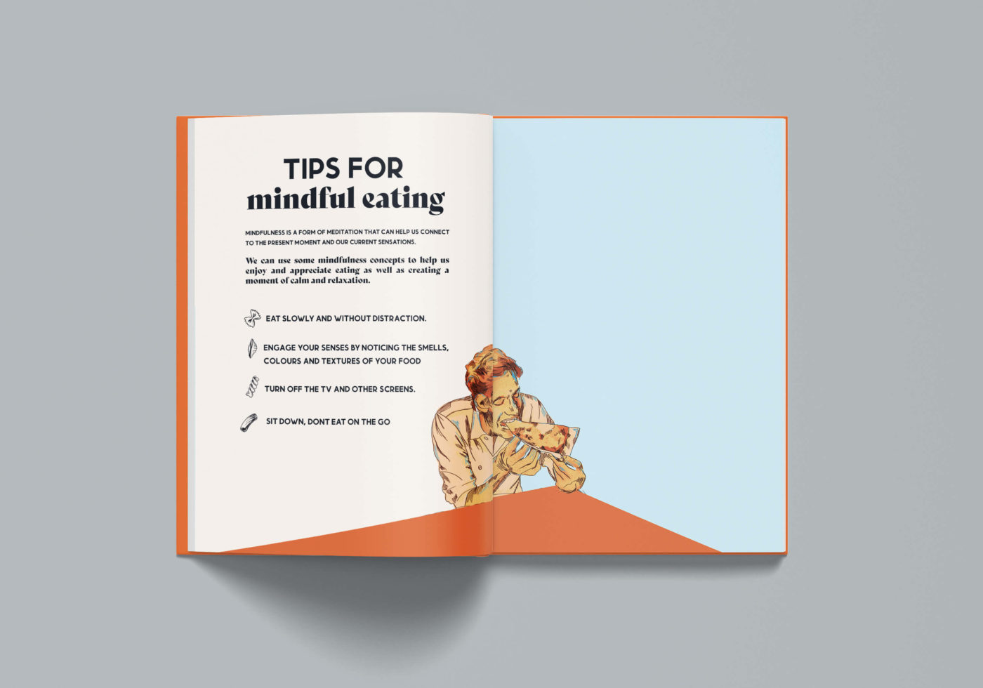
The Kind Cook is a brand centred on promoting a healthy relationship with food and encouraging people to see cooking as a form of self-care and relaxation. The brand was inspired by the rise in people taking control over their mental wellbeing with meditation and self-care becoming increasingly used devices to nurture yourself. I saw a lack of cooking and eating being incorporated into this world and saw the Kind Cook as an opportunity to provide people with a way they could turn an everyday activity into a meaningful part of their wellbeing.
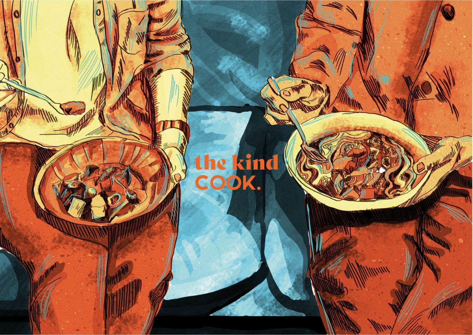
The Kind Cook is the outcome brand of my final year project. The brand promotes developing a healthy relationship with food and cooking as a form of self care
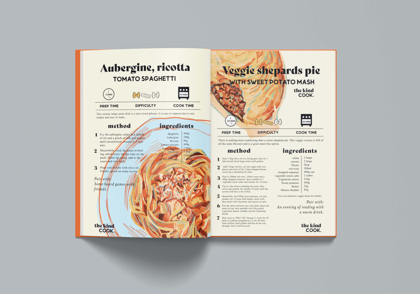
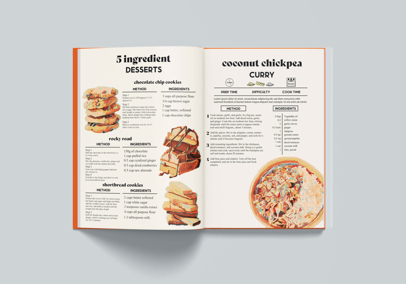
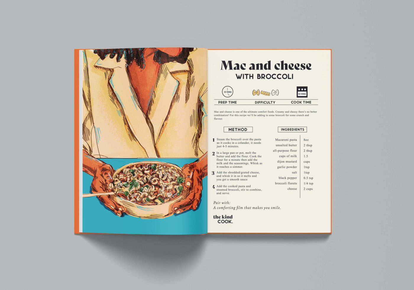
The main outcome of this project was a cookbook. Although we are entering the digital age, there is something reassuring about having a physical book. I chose to go down the print route rather than digital as a focus of the Kind Cook is mindfulness which encourages us to take a break from screens.
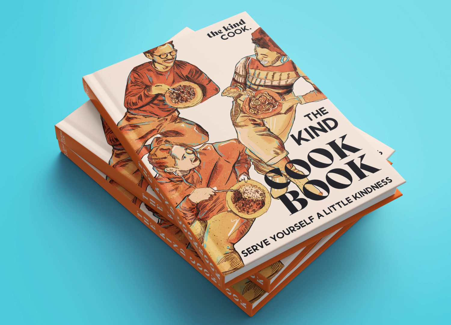
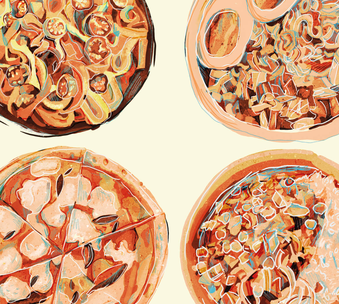
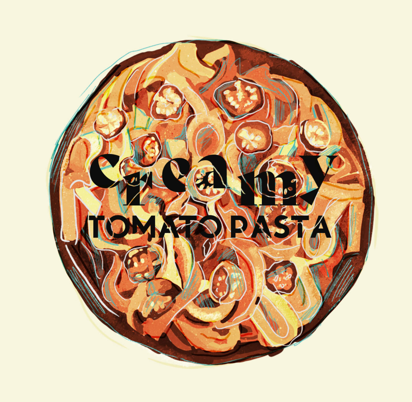
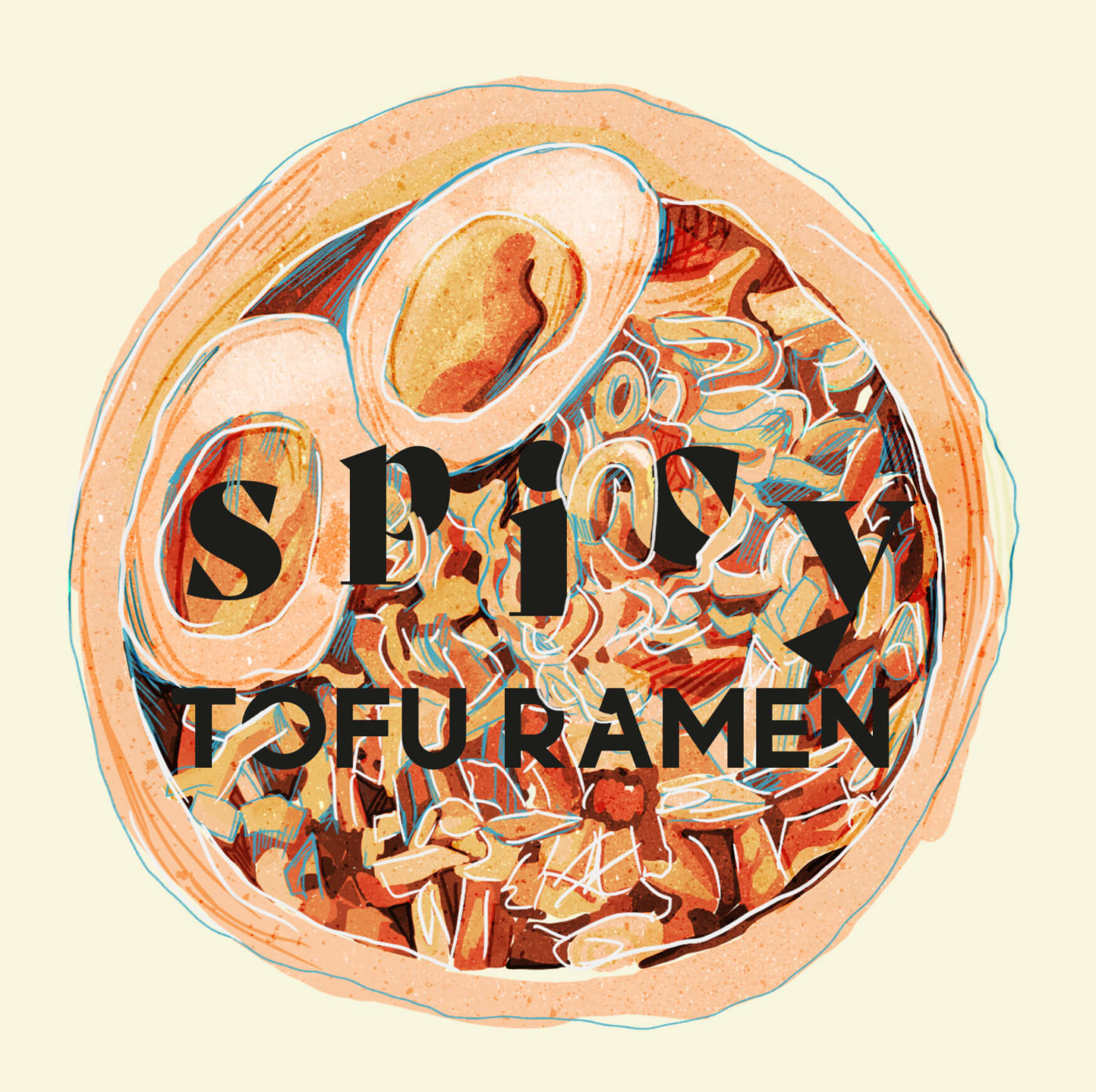
Book cover design for the Kind Cookbook. The imager was focused around eating and friendship to add a human nature to cooking rather than just showing images of food.
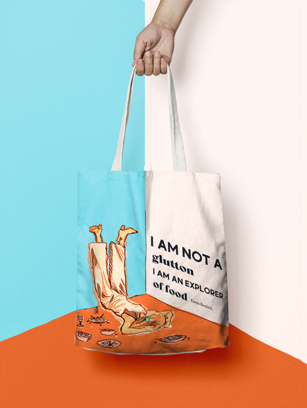
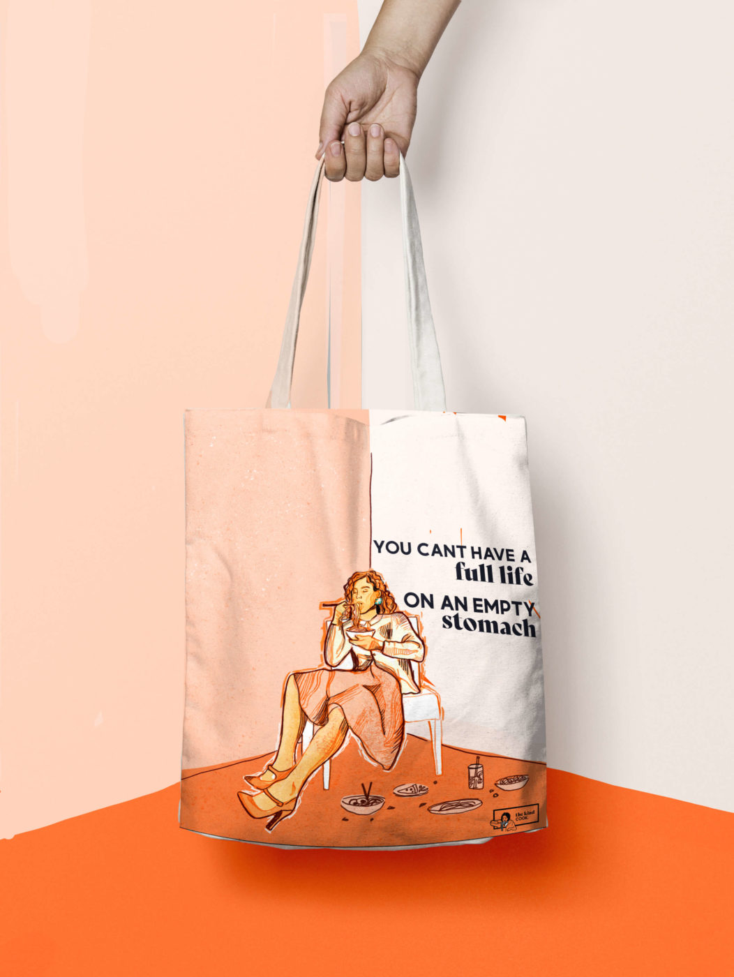
The merchandise for the company needed to show the fun spirit of the brand while also tying in the food and cooking aspects.
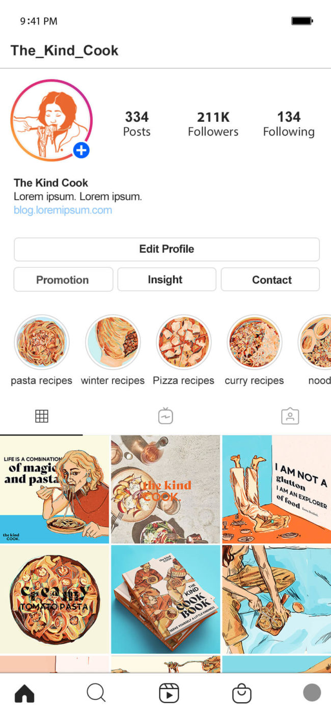
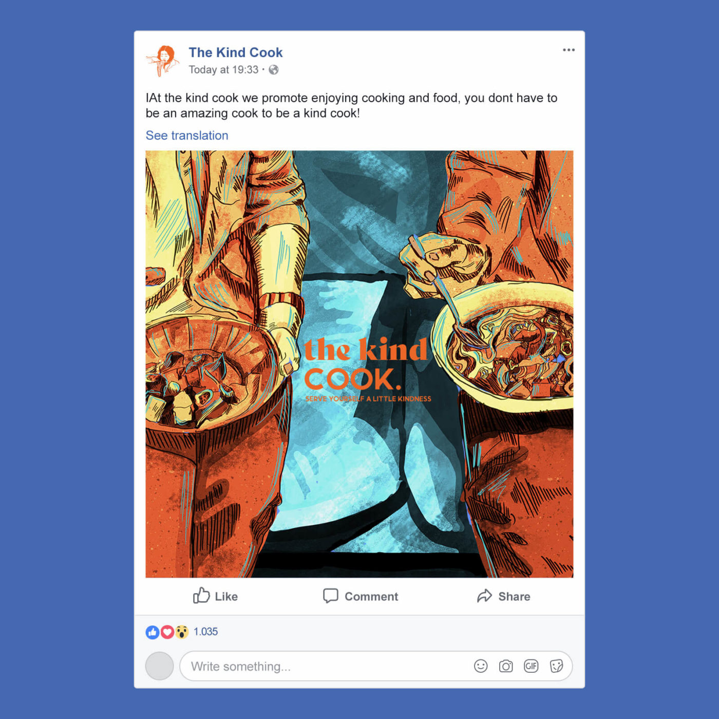
The social media presence also focused on creating a fun and inviting space and sought to avoid comparison and the negative impact which social media can sometimes have.
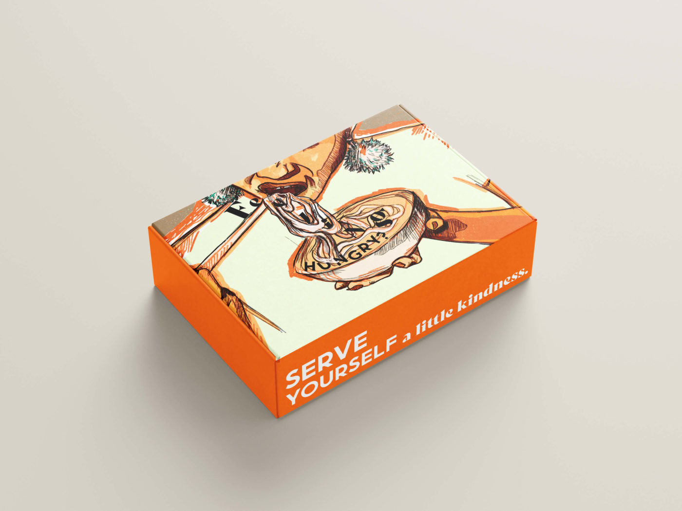
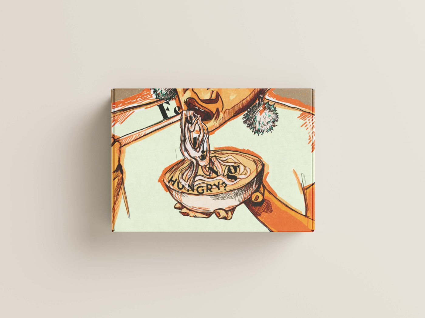
The Kind Cook would also have a delivery box which would consist of the ingredients you need for a recipe as well as recipe cards to remove some of the stress of cooking and allow you to have a fun and relaxing time.
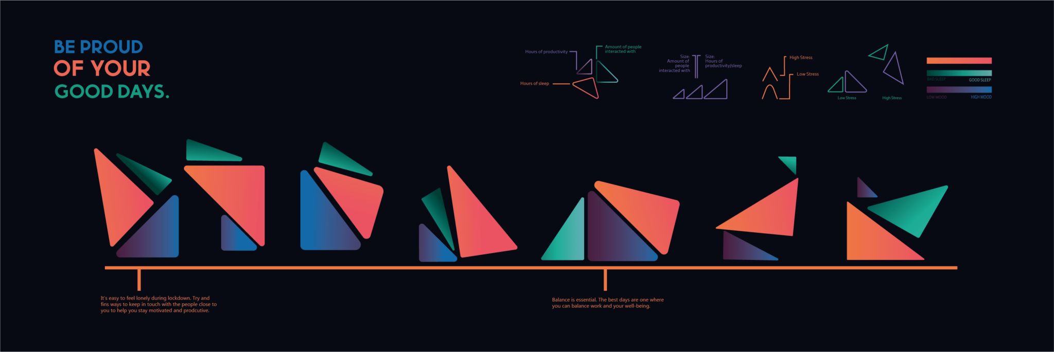
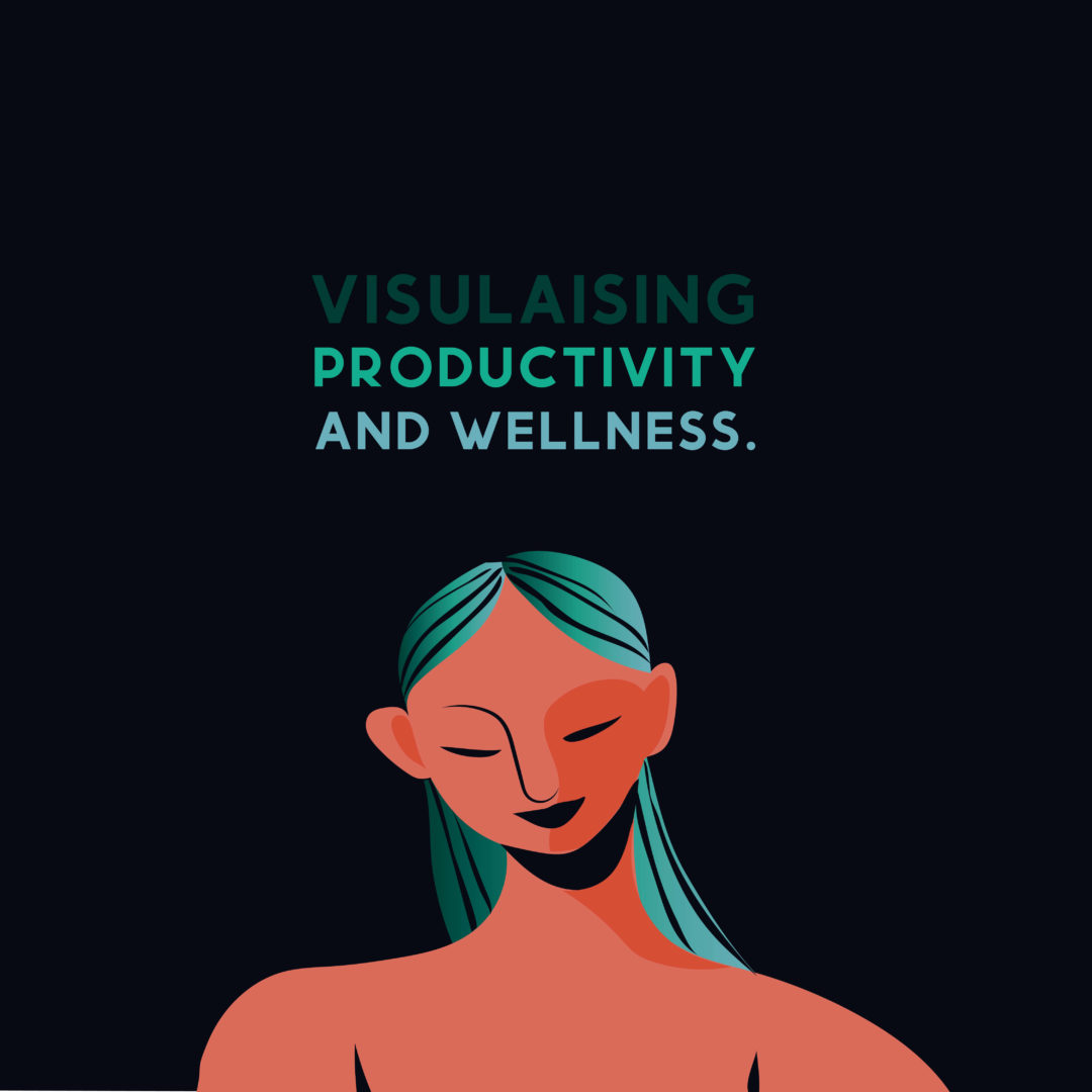
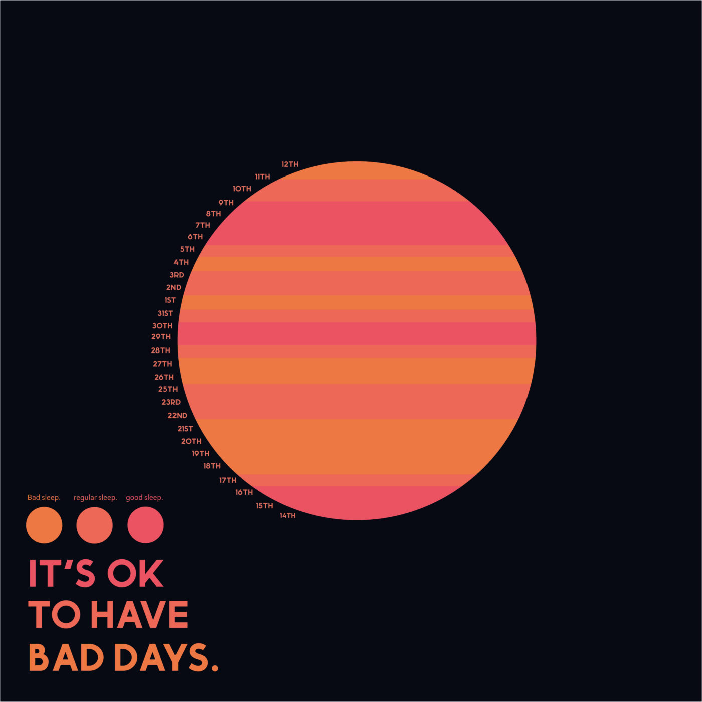
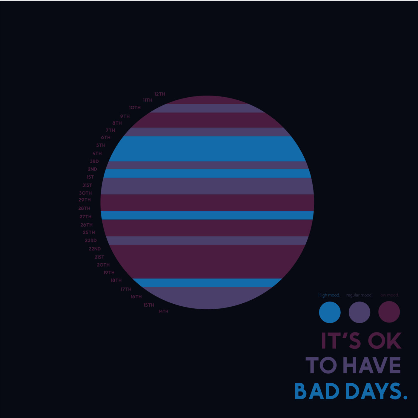
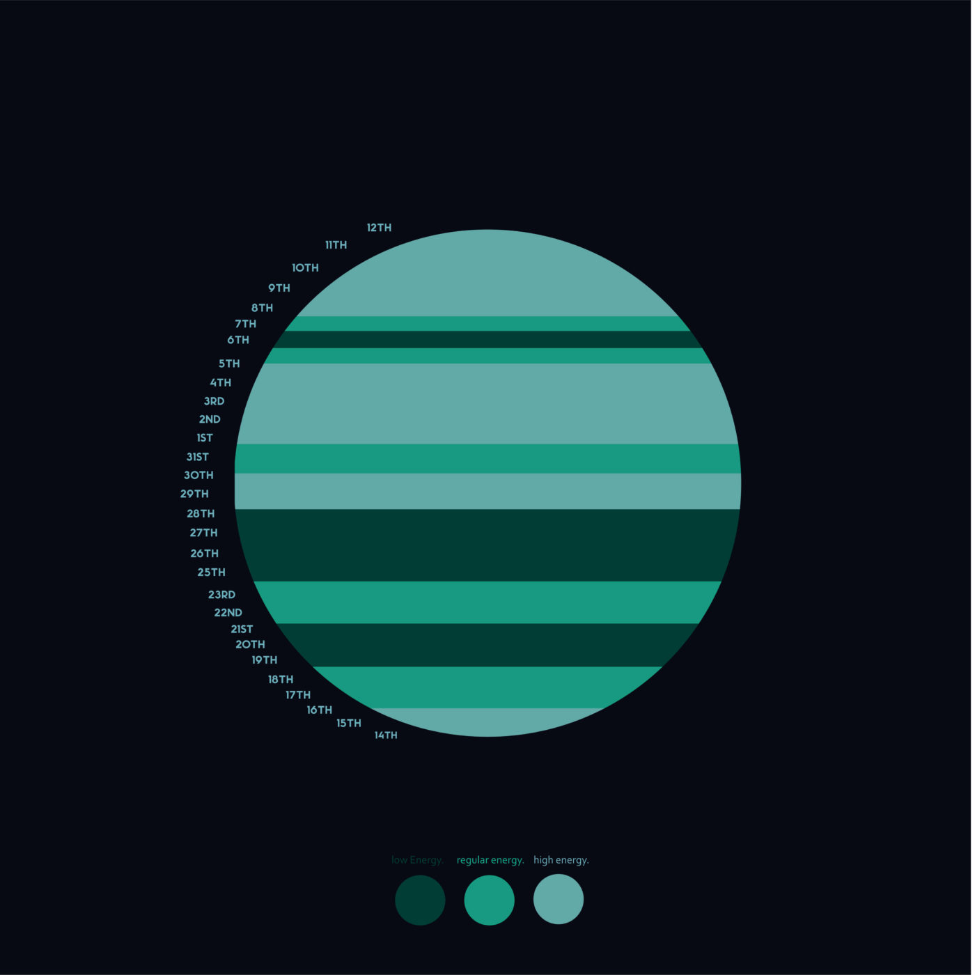
Visualising Productivity and Wellness
This project was focused on information design and finding beautiful ways of representing data. For my project I recorded my own productivity and wellbeing habits and activities to try and discover links and ways to increase productivity. The outcome is focused around clearly communicating the data while trying to avoid anything too numerical or graphical. The result was a series of minimal vector representations of the data.
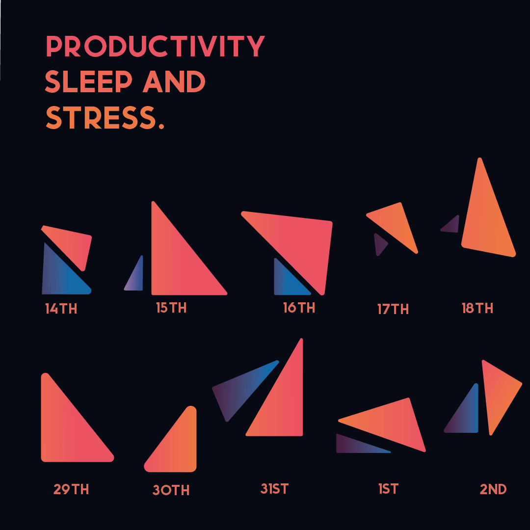
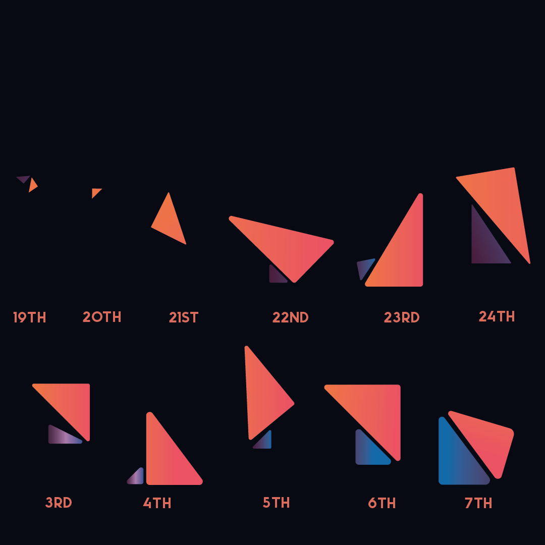
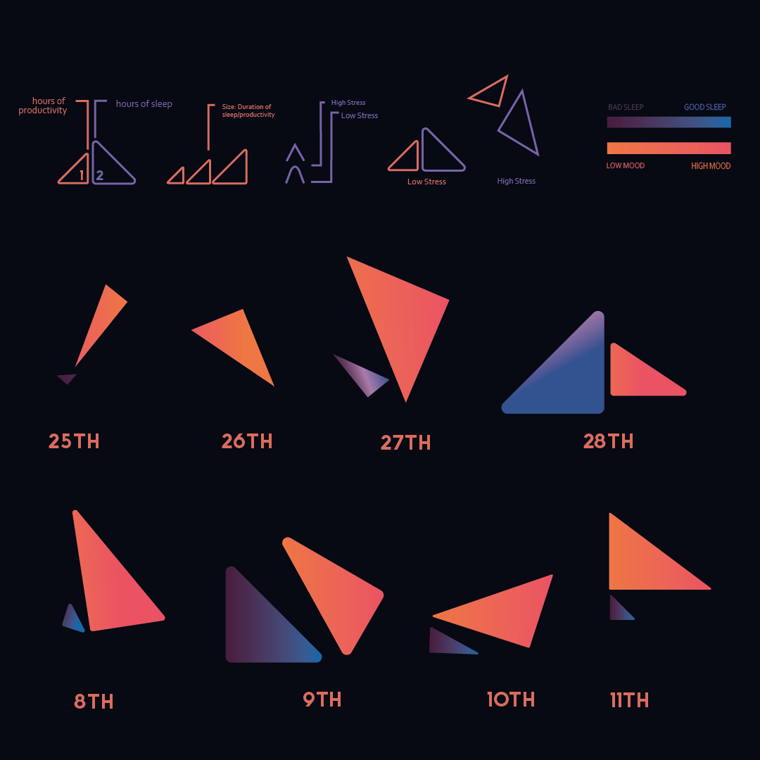
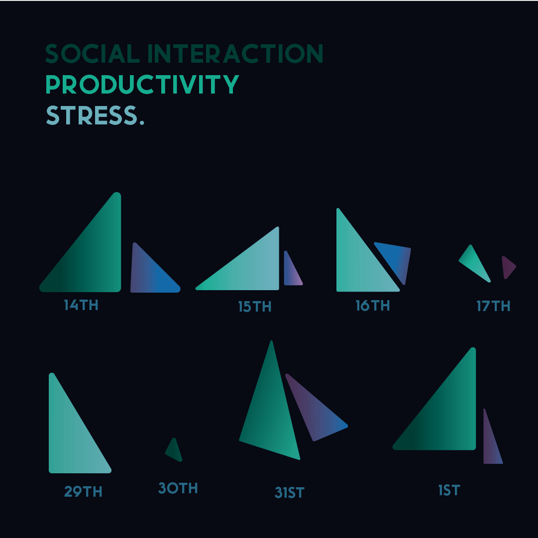
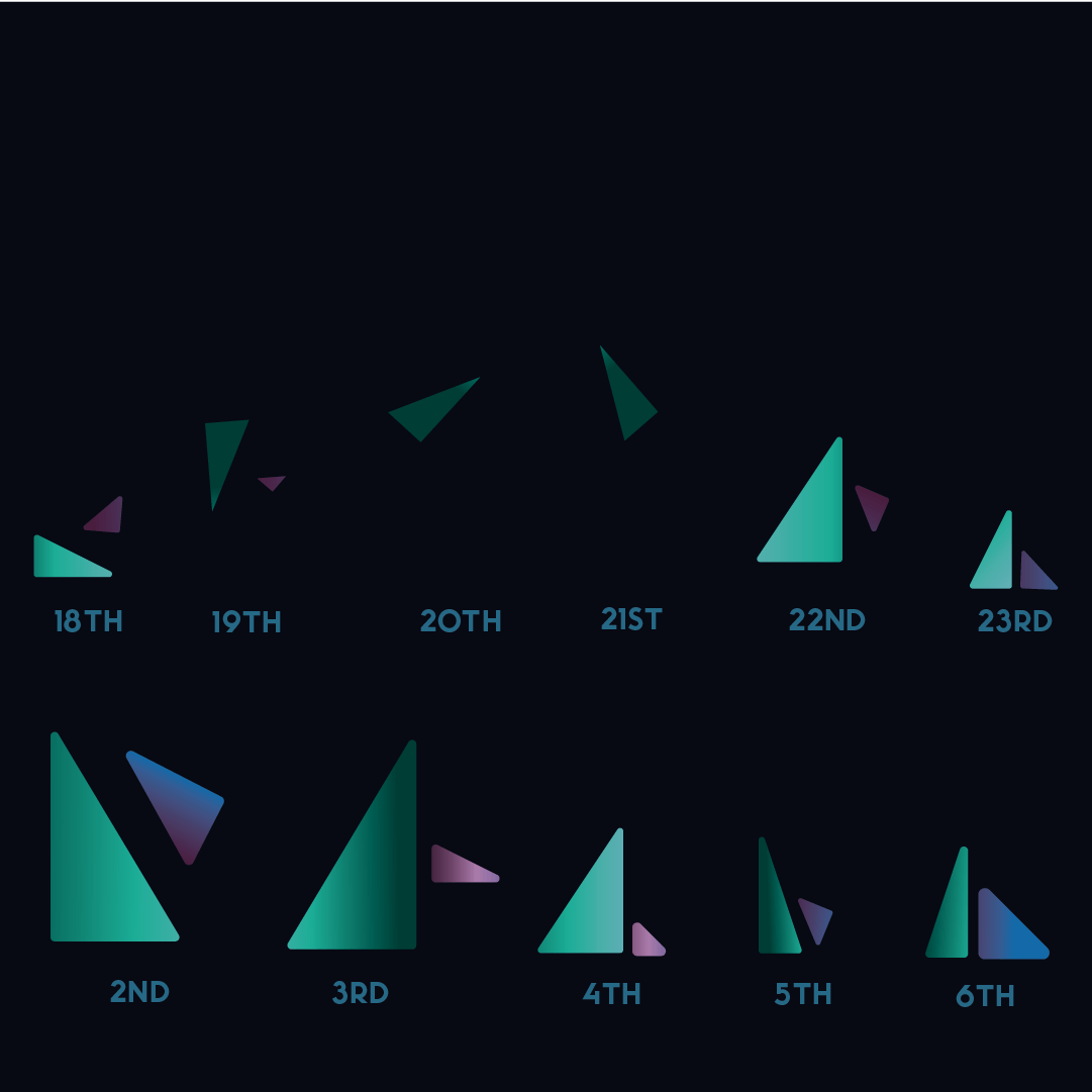
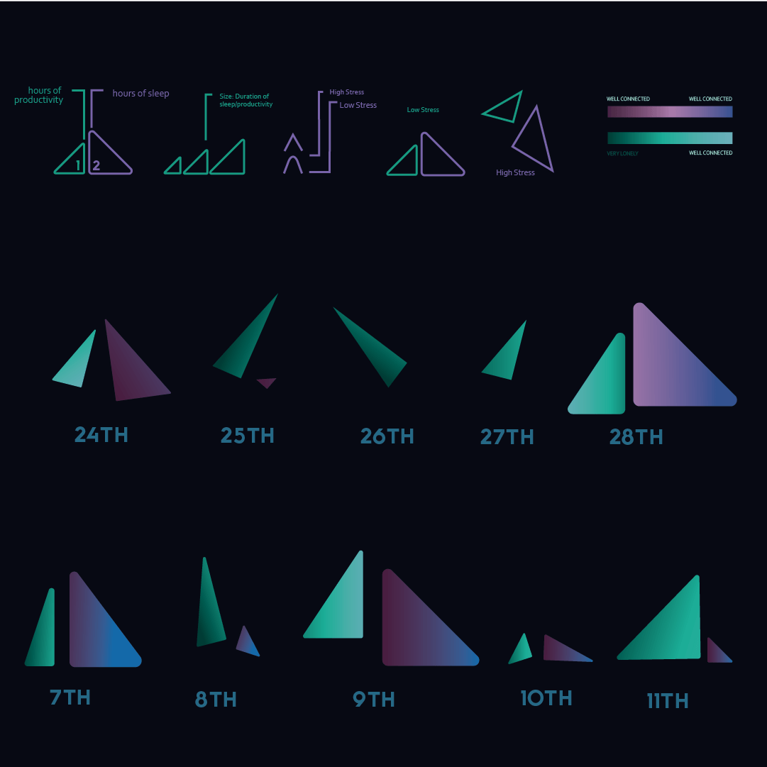
These images used colour and shape size to communicate the recorded data.
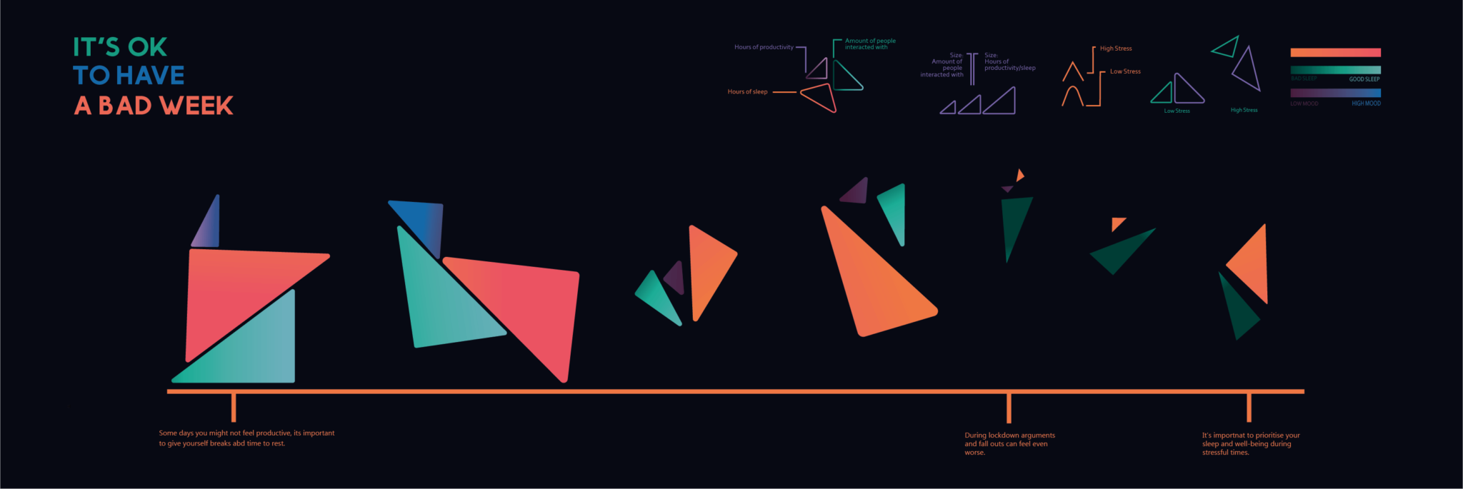
The triangles in these designs followed several rules to communicate different sets of data. By combining sets of data into one shape it created a sleek and minimal design.